Logo is an abbreviation of logotype. A good logo will make the brand easily recognizable and unique. It is a visual symbol that communicates with people's inner being and even an abstract image can reflect the real meaning and image in people's inner mind. Any business must discuss the logo design of the business at the beginning of its establishment. While big businesses will hire a professional design team for several discussions, there is no need to spend too much money on logo designing for a small business which is already difficult to set up. You can choose to do the design yourself with the help of some tools. We recommend EximiousSoft Logo Designer Pro, which is dedicated to helping users design logos, and we'll talk about how Logo Designer Pro can help designers customize unique, outstanding and memorable logos in several technical points.
Broken letter is usually the first letter of brand name. There is also logo designs that make it as the initials graphic, thus unifying the graphic with the text. For example, Pentagram breaks the letter "O" in the open view to visually communicate openness.

So how do you achieve the cutting of characters in EximiousSoft Logo Designer Pro? First type the text Brand Name in the canvas. Then after selecting the font and font size of the text, you need to convert the text object into a path object. Use the Selection Tool to select the text, switch to the "Path" category in the Ribbon Bar, and then click the "Object to Path" button to realize the conversion of text objects to path objects. Then use the Pen tool to draw a straight line along the cut direction of the letter. Default pen width is 1 pixel. Select both text and straight line, also in the "Path" category click on the "Division" button, the letter will realize the division. Finally, after the division of one of the small pieces to move a distance can be.
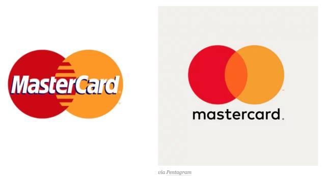
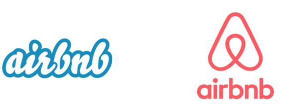
Nowadays, almost all designs are moving in the direction of flatness and simplicity, and logo design is no exception. As you can see in the image below. In the Mastercard and airbnb brand redesigns, the visually busy logos were replaced with streamlined, simple designs. In addition to the rebranding of brand logos, simplification of form is also present in the new logos. The extreme simplicity is also reflected in the two packaging examples shown below.


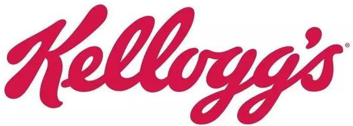
The picture below shows the logo of the famous American food company Kellogg's, which is a typical handwritten style logo. Handwritten English logos usually use lowercase because the English structure of lowercase is more complex and the height between different letters is different, which is more suitable for handwriting style. This type of handwriting style logo is very approachable and eye-catching.

There are a few key points to keep in mind when designing a handwritten logo:
In Logo Designer Pro, the "Brush" tool is provided for hand-drawn lines. In fact, several handwriting fonts are provided by default in Windows. For example, Brush Script Std, Buxton Sketch, strato-linked fonts. The lines are beautiful and staggered.

|

|

|
| Brush Script Std | Buxton Sketch | strato-linked |
Since ancient times, mankind has been obsessed with geometric shapes, which have appeared in the frescoes and documents of various ancient civilizations, inspiring civilization, giving rise to technology, and enriching literature and art. Circular structures, intersections of lines, and solid triangles have appeared countless times in our texts, architectural designs, works of art, and even technological devices. Of course, most often, it's the same thing we see every day, appearing on almost every product, logos and logotypes.
Logo Designer Pro provides 5000+ vector geometric shapes and symbols. They can be added to the Logo as needed during the design process. Of course, the existing path symbols are simple and can be combined into an advanced and complex geometry depending on the actual need and the path tools provided.